Smoother implementations start with shared understanding, and that starts with diagrams.
If you’ve ever run a Salesforce or NetSuite implementation, you already know: the tech rarely breaks. What breaks is alignment across teams, stakeholders, and stages. Projects stall not because people aren’t working hard, but because they’re working from different mental models.
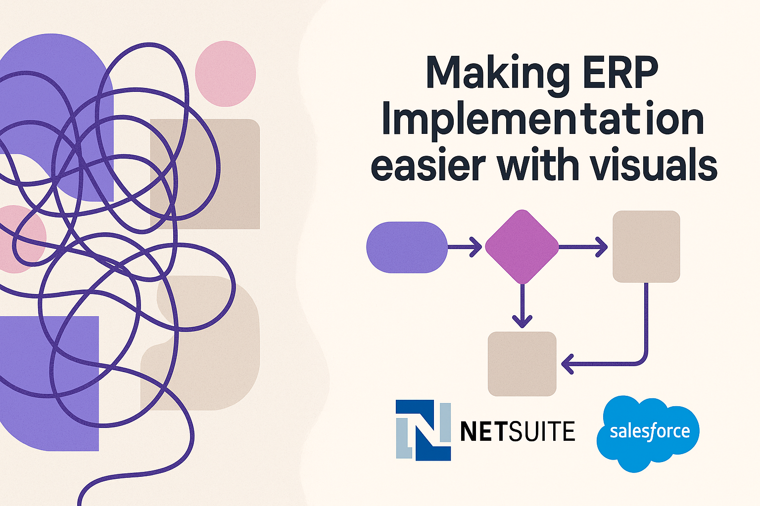
This is where visual process maps come in. They don’t just document the plan; they create clarity, accelerate decisions, and reduce risk at every phase of implementation.
In this article, we’ll walk through a typical end-to-end implementation journey and show where visual mapping tools (like Splotch) add the most value, without overhauling your entire methodology.
Phase 1: Discovery & Qualification
Pain Point: Stakeholders aren't aligned on the problem being solved
Visual Support: Light touch; stakeholder maps or outcome trees if needed
This phase is about gathering context, scoping needs, and qualifying fit. While not the most visual phase, some firms benefit from simple stakeholder maps or high-level outcome trees to clarify what “success” looks like, especially when non-technical decision-makers are involved.
Don’t over-diagram here. Save the visual muscle for when complexity spikes in later phases.
Phase 2: Solution Design
Pain Point: Misaligned expectations on how the solution will actually work
Visual Support: High-level blueprints, solution outlines, and architecture diagrams
This is where misalignment creeps in. The sales team has promised X. The implementation team hears Y. The client expects Z.
Visual solution blueprints, even if they're rough, act as a shared reference point. They help translate business needs into tangible components before config work begins.
Here’s where Splotch fits naturally. It lets implementation teams turn early sketches into clear, editable diagrams that update as the plan evolves. Everyone sees the same solution taking shape, and that prevents expensive rework later.
Phase 3: Architecture & Integration
Pain Point: Integration assumptions go unvalidated until too late
Visual Support: Integration maps, data flow diagrams, system architecture visuals
Integrations are make-or-break. One missed assumption about how NetSuite talks to a custom Salesforce object, and you’re reworking weeks of effort.
Instead of dense technical specs, system-level architecture diagrams give both business and tech teams a bird’s-eye view. Who owns what? What touches what? What needs to sync in real-time?
Diagramming this early creates a powerful artifact, one that’s useful not just for planning, but for onboarding new team members, looping in third parties, or presenting to leadership.
Phase 4: Business Process Mapping
Pain Point: The current-state vs future-state gap goes undetected
Visual Support: As-is / to-be process maps
This is one of the most crucial (and under-leveraged) visual opportunities. Teams often jump into configuration without mapping the actual processes they're trying to improve.
That’s where implementation firms run into scope creep, delays, or internal resistance: the end users don’t see their reality reflected in the new system.
Mapping both current and future workflows makes the invisible visible. It uncovers duplicate steps, ownership gaps, or compliance risks before the system is built.
With tools like Splotch, these aren’t static Visio exports, they’re living diagrams that stay editable and shareable throughout the project. That means you can co-design processes with your client instead of for them.
Phase 5: Project Planning & Timeline Overview
Pain Point: Dependencies are unclear, timelines get misinterpreted
Visual Support: High-level timelines, swimlanes, and dependency diagrams
Even with project plans in place, many teams miss the visual thread: how will this all unfold across teams and phases?
A simple timeline map, with clear swimlanes and milestone markers, helps everyone understand what’s happening when and who’s on point. Visualizing interdependencies also reduces last-minute surprises.
This is especially useful when multiple vendors are involved (e.g. a Salesforce partner + a NetSuite partner + internal IT). A shared visual keeps handoffs smooth and accountability clear.
Phase 6: Post-Go-Live & Continuous Improvement
Pain Point: No clear plan for what comes next or how it will evolve
Visual Support: Roadmap diagrams, optimization maps
Go-live isn’t the end, it’s just the first release. But many clients don’t understand what comes next, or how they should prioritize optimization.
Roadmap visuals turn long-term improvement plans into something real. Instead of saying, “We’ll optimize reporting in Phase 2,” you can show what Phase 2 entails, when it starts, and how it builds on what’s been launched.
This creates confidence. It also helps with internal buy-in and budgeting, when stakeholders can see the path, they’re more likely to support it.
Better Diagrams, Better Delivery
You don’t need to change your whole delivery model to make Salesforce or NetSuite implementations smoother. You just need better shared understanding, and that starts with visuals.
Whether it’s mapping current processes, outlining architecture, or building long-term roadmaps, visual process maps reduce confusion, accelerate decisions, and align teams. Tools like Splotch make that faster and easier, with diagrams that update as the project evolves.
Because smoother implementations don’t come from better guesswork. They come from clarity.